Thursday, January 29, 2009

finally


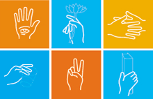
So, last semester, Leo Divendal came to VCU Graphic Design for our guest lecture series, Objects + Methods. The students in each section of letterpress were invited to do a week long workshop with him (awesome for them, bummer for me). 5 guest lecturers come each semester and a lot of the designers will do workshops with students. Anyways, next week Jean-Benoit Levy, noted experimental typographer, poster designer and author, is coming for O+M and, this time, my class was invited to participate! The iamge above is from his book Handbook, written about his creation of an alphabet based on hand signs.
"Jean-Benoit will be working with students to create either a poster or a short Flash animation (depending on student's interest) around a central theme. He will work with you to develop your ideas and your design.It will be an amazing opportunity to work directly with Jean-Benoit who hails from the Basel School in Switzerland."
I have not had the chance to work on many posters in the last two years, so this is going to be an awesome experience.

^D
sarah

Saturday, January 24, 2009

clouds

I was first introduced to the work of Ronan and Erwan Bouroullec last semester. I am drawn to their use of intricate patterns and elegant execution. Their work maintains a certain graphic quality that I relate to moreso than that of other interior designers. These are images of their new Clouds project.

Clouds evolves as you add elements to it, producing a unique three-dimensional effect, coating architecture in a fluid yet chaotic way. Inspired by the inviting irregularity of the surface, you construct your own piece and turn your vision into reality.

The tiles are made of one element and are attached by special rubber bands. This simple design means you can easily arrange and re-arrange the tiles to reflect your ideas and bring self-expression into your home, time and time again.

Clouds is available in 2 Kvadrat fabrics, 7 colour combinations and infinite possibilities.


awesome.

^D
sarah

Friday, January 23, 2009

cupcake monster


I love cupcakes. I have been asking Andy to bake some for me, but the prospect of this actually happening is beyond grim. He sent me this cute stop-motion animation instead and I wanted to share. Had he actually baked me a cupcake, I would not want to share. It was created by Kirsten Lepore, it's long, but adorable.


Speaking of cupcakes reminded me of this brilliant, hand blown cupcake platter by Amanda Goss. The fact that she was 22 when she produced this idea is inspiring. I hope they are still for sale, it's going on my birthday list.

^D
sarah

Wednesday, January 21, 2009

addicted to polos


I am not addicted to polos, nor have I ever been moderately interested in their existence. I have, however, had this post on my mind for some time now.

I read most of Naomi Klein's No Logo last semester (a surprisingly interesting read considering the lack of images and abundance of facts and figures). She talks about brands like Nike, Tommy Hilfiger, and Polo in hip-hop culture.

"Tommy Hilfiger, even more than Nike or Adidas, has turned the harnessing of ghetto cool into a mass-marketing science. Hilfiger forged a formula that has since been imitated by Polo, Nautica, Munsingwear and several other clothing companies looking for a short cut to making it at the suburban mall with inner city attitude.

Like depoliticized, hyper-patriotic Benetton, Hilfiger ads are a tangle of Cape Cod multiculturalism: scrubbed black faces lounging with their wind-swept white brothers and sisters in that great country club in the sky, and always against the backdrop of a billowing American flag...

Tommy Hilfiger started off squarely as white-preppy wear in the tradition of Ralph Lauren and Lacoste. But the designer soon realized that his clothes also had a peculiar cache in the inner cities, where the hip-hop philosophy of "living large" saw poor and working-class kids acquiring status in the ghetto by adopting the gear and accoutrements of prohibitively costly leisure activities, such as skiing golfing, even boating.
Perhaps to better position his brand within this urban fantasy, Hilfiger began to associate his clothes more consciously with these sports, shooting ads at yacht clubs, beaches, and other nautical locales. At the same time, the clothes themselves were redesigned to appeal more directly to the hip-hop aesthetic."


I love Young Jeezy, and it is only appropriate that I mention his track, "My President" today, as Barack Obama took the position just over 48 hours ago. It might seem trivial, but I was pretty stoked on making a connection between what Naomi Klein is saying here and what Nas [he wrote the lyrics] is asking when he says,

"I said I woke up this morning, headache this big,
pay all they damn bills, feed all these damn kids,
buy all these school shoes, buy all these school clothes,
for some strange reason, my son addicted to Polos."
Nas's son is addicted to Polo because Tommy Hilfiger paved the path for their company. Hilfiger was successful because he ignored moral boundaries.

Negative links like these, links that bring design to society in a negative way, have helped me to realize just how important it is for me to use my design for good.

^D
sarah

Saturday, January 17, 2009

Obama for Mankind


The inauguration is so close, and I can barely contain myself. I wish my thoughts communicated better with my words so that I could explain the incredible feeling I get every time I consider the possibilities for our country's future. I'm elated. The same hop I found in my step on November 5th finds its way back each time I recall our new president-elect, each time I recall the millions of others who set aside bias, personal interests, and even politics in hope for a change.

I never had a chance to post these on Election night, so here are a few of the photos I took of the Obama parade. That night I felt excitement and relief, but I also found a great degree of comradery. It was as if the minor details that divided us each day no longer existed, we did this together and we would celebrate it together. Best night of my life to date.


{CLICK on these images to enlarge//You can find more pictures of that night on my Flickr page: http://flickr.com/photos/sarahkeane}

LittleBigPlanet!

{IMAGE: www.mediamolecule.com}

So, last month, I saw this commercial for a game titled LittleBigPlanet. The definition of cute, Sackboy (pictured) acts as the highly customizable mascot.

This month, I received my last issue of Print (bummer). I was confused when I realized that LittleBigPlanet was a feature story. But, the nature of the game could mean new and exciting things for designers. The game runs on Sony's newest console, Playstation 3. Sackboy is a platformer, and though the user is able to navigate pre-designed levels, they also have the ability to create their own. Your game controller acts almost as a keyboard, with Sackboy as your cursor.
"In the future," says Sven Travis [the founder and chair of the Communications Design and Technology department and Parsons The New School for Design] "all design work including print layout, print design--will be done on game consoles." {QUOTE: Print Magazine}

Friday, January 16, 2009

my design work

I'd like to start posting some of my own work for critique on here. I will be graduating in May and I want my portfolio to be in tip-top shape. I'll try to post more frequently about current events, design news, and my own stuff. I want this blog to be about design, but design is really about everything!

Here is an identity system I designed for wee talk, a speech therapy center for children in Richmond, VA. Amy Carlton is the owner and worked with me through Laura Chessin at VCU. They were both amazing throughout the entire process, and very patient. Amy focuses on treating preschool-aged children with apraxia of speech (a condition in which the child intends to speak, but cannot translate conscious plans into motor plans. In other words, the child knows what they want to say, but cannot say it.) She really loves what she does and was enthusiastic about every design approach. I was incredibly luck to have such a great experience with my first real world project.

The logo and identity as seen here were inspired by the moment of clarification for the child. The moment when they are able to connect their thoughts with their actions and speak.

the logo (Typeface: Futura):

Brochure: Front and Back covers (Typefaces: Futura / Meta)
//Click photos for more detail.

Brochure: Inside Spread (Typefaces: Futura / Meta)


What do you think? Any suggestions?

howirichmond.com

Myself and a group of 6 other students started this website last semester in our design rebels class. A lot of revisions have been made since I left for break (I can't take credit for any of them, Mike Doughtery and Mark Luetke have been working really hard). It still needs a lot of work, design and content wise, so take a look and let me know what you think...design suggestions, content suggestions, anything. We have a meeting with BikeWalk VA in about an hour, we are trying to get the ball rolling an an alternative transportation alliance in Richmond.